3rd September 2014
Coding
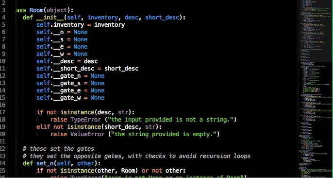
HTML
This stands for "HyperText Markup Language" and is the basic language for coding a web page. It follows a set of rules, including a way to open the code and let the browser know what language you're using. You can do this with: "<!DOCTYPE html>" You'll notice this uses another rule in this code, which are parenthesis symbols "< >". There are quite a few other rules this code follows, such as using lines to activate certain triggers, which end with a "/>" symbol. Without these rules, the website will not function.
CSS
This stands for "Cascading Style Sheets" and is combined with HTML to add aesthetic design. In a way, the HTML is the skeleton of the website, whereas the CSS is the code that makes it all pretty.
Javascript
Javascript is another form of code used for web design. Think of it as a more advanced version of CSS, but with more capabilities. It can be used for other things, such as games design, meaning you can also add extra features to websites, using it as essentially HTML and CSS combined. The downside to this, is Javascript is quite a bit more complex than either CSS or HTML.
Code Academy
Today I've been taking a tutorial on coding on the Code Academy website. I started off by selecting the HTML language to try and get the basics of coding down. I was told to type a sentence between two pieces of text between "< >" these symbols. It looked something like this:
<strong> feel free to change this text </strong>
Very polite, giving me the option like that. So I typed this
<strong> This code is stupid! </strong>
and was then greeted with my first badge after clicking "save and submit code." It looked something like this:

The text on the side started off with what seemed to be something important "HTML stands for HyperText Markup Language. Hypertext means "text with links in it."
Learning already! I was learning HTML, which according to the program was the bones of the code, while CSS was what made everything look nice, the skin if you will. The following points were mentioned:
a. Always put
<!DOCTYPE html> on the first line. This tells the browser what language it's reading (in this case, HTML).b. Always put
<html> on the next line. This starts the HTML document.c. Always put
</html> on the last line. This ends the HTML document.I then proceeded to type out this piece of code:
<!DOCTYPE html>
<html>
What pumpkin?
</html>
Congratulations for those of you who get the reference. All this code does, is display the text "What pumpkin?" on a webpage. Text 101, I saved and submitted code, then moved on to the next task.
Page 3 explained how things between the < > symbols are called tags, and that almost all tags come in pairs, and opening, and closing tag, E.G: <html> Text goes in this bit, followed by a closing tag here </html> making up your code. Think of it like brackets (like this) but with more stuff.
Apparently you can put tags within tags, meaning the most recently opened tag, must be the first to close E.G: <first tag><second tag>Stuff to do with things!</second tag></first tag> and so on if you decide to add more.
I wrote out another code, the instructions telling me I could write whatever I like between the tags, just like before, so my code consisted of:
<!DOCTYPE html>
<html>
Whatever you like
</html>
And on to the next: I was told now that I needed to add a title to my webpage, using the tag "head" in the appropriate way, as in header, followed by a "title" tag:
<!DOCTYPE html>
<html>
<head>
<title>
Hey look now I'm coding
</title>
</head>
</html>
This is what I typed out, looks kind of long winded. Nothing appeared on the webpage but when clicked submit, it let me pass, so I can only assume I won.
The following page looked like this, all the information can be seen on the side:

So I rewrote my code, followed the instructions about creating the body of the webpage, and this is the code I came up with:

So far so good, I was starting to make everything look just as overcomplicated as professionals do when they code things!
On second thoughts...
Luckily I earned my second badge at this stage, my first lesson badge! See below:

The code I could see pre-typed for me was this:
<!DOCTYPE html>
<html>
<head>
<title>
Headings & Paragraphs
</title>
</head>
<body>
</body>
</html>
And presumably I was meant to fill in these giant blank bits with my new second-to-none coding skills consisting of tags and bracket styles. I was ready for anything this program could throw at me, as long as there were step by step instructions to the side telling me exactly how to progress.

It's everything I'd hoped it'd be! I was now starting to get tags and heads and bodies stuck in my head! Try looking at that out of context!
The next set of points were brilliant:

<!DOCTYPE html>
<html>
<head>
<title>
Headings & Paragraphs
</title>
</head>
<body>
<h1>
Content
</h1>
<p>Whatever content I like. Take a look at my amazing coding skills!</p>
<h3>Heading number two has been formed, see?</h3>
<p>Although apparently that's not quite enough and I need mutiple paragraphy bits.</p>
<h5>Sorry how many headings do I need?!</h5>
<p>I'm just forming nonsense! Coding really is just what I expected! Lots of nonsensical letters all over the place!</p>
</body>
</html>
Coding at its finest! The next lesson was essentially getting me to add all the other sizes that weren't in the code before. My finished code wall can be seen below:

Here we can see my amazing coding and just how bored I got with typing headers.
Then finally, adding the various paragraphs to the headers:

The tutorials were starting to get repetitive, but hey, at least I was retaining the information! The next piece of code looked like this:
<!DOCTYPE html>
<html>
<head>
<title>
Testing testing 1 2 3
</title>
</head>
<body>
<h3>Just let me learn something new!</h3>
<p>So I'm meant to put personal informationhere and I refuse so nyeh</p>
<p>Of course I'm meant to do three of these paragraphs</p>
<p>So I have to fill them with something</p>
<h1>
Content
</h1>
<p>Whatever content I like. Take a look at my amazing coding skills!</p>
<h2> Slightly bigger than the text below!</h2>
<p>This amount of text is stupid!</p>
<h3>Heading number two has been formed, see?</h3>
<p>Although apparently that's not quite enough and I need mutiple paragraphy bits.</p>
<h4>Slightly smaller than the header above</h4>
<p>I wanna be the very best, like no one ever was!</p>
<h5>Sorry how many headings do I need?!</h5>
<p>I'm just forming nonsense! Coding really is just what I expected! Lots of nonsensical letters all over the place!</p>
<h6>And this is apparently the size that serves the tea.</h6>
<p>look at this glorious paragraph</p>
</body>
</html>
I feel like a computer genius.
Now we all know those pieces of text that don't look like a web adress and have no right to be a hyperlink, yet the blue highlight and underline lets you know the truth! This piece of code shows me how to do just that!
<!DOCTYPE html>
<html>
<head>
<title></title>
</head>
<body>
<a href="http://www.codecademy.com">Here click this because I said so.</a>
</body>
</html>
Now the next page introduced me to something new, imagery! Apparently, in order to place an image on your webpage, you need to get the image URL with a right click, the type <img src="ImageURLhere" and put it somewhere in the body section. Here's what I did:

The next page started to tell me about putting links in images to have them lead you to other places. First you're meant to link the duck to the code academy website itself, so I did, then I linked the image I places with a certain website he's involved in.

The next page decided to test my new found skills and told me to code in two images, one with a link leading to a random page, the next without, then code in a sentence, also linking somewhere, I came out with this:
<!DOCTYPE html>
<html>
<head>
<title>The land of links</title>
</head>
<body>
<a href="http://thebest404pageever.com/swf/cage.swf"
<img src="http://img2.wikia.nocookie.net/__cb20121021201838/mspaintadventures/images/d/d1/Johnangryflash.png"/></a>
<img src="http://cdn.thesurveycorps.com/wp-content/uploads/2014/01/AOTVG2014.jpg"
<a href="http://www.mspaintadventures.com/?s=5"
<p> This leads to something, probably...</p>
</body>
</html>
I feel I've done a good job here, and for my efforts, I even earned a new badge!

The HTML course was complete! I was now offered the chance to build my own webpage in the "Build your won webpage" course. Figures.
These were all the badges I managed to collect during the tutorial:

The final page http://www.codecademy.com/courses/web-beginner-en-HZA3b/2/6?curriculum_id=50579fb998b470000202dc8b
Task 2- Poetry Slam
I was given a task, along with multiple others, to design a website for an event known as "The Poetry Slam." The previous website was to be replaced with my new and improved version, created with my newly acquired coding wizard skills. The client mentioned these features to be added:
Target audience-
Teachers, Young people, schools, and librarians. The client also requested the target audience to include language schools, community groups, prisons and businesses etc.
Appearances-
The current website is described as "Dry, plain" and old, they want the newer version to be exciting and visually appealing.
Specifics-
The client specified they wanted a slideshow banner on the main page including quotes, pictures, videos etc that rotate on a cycle to give an idea of what the poetry slam is like. Then another slideshow-like thing with pictures fading in and out and quotes, much like the above, but possibly not necessarily a banner, on the events page. He mentioned it would also be good if we could put in testimonials on the pages for school, arts festivals, and business training to show that previous participants enjoyed themselves.
General Requests-
The client asked that we change the events page to make it more "exciting and somehow list previous and upcoming events/workshops, but more importantly show photos and quotes from previous workshops, that either rotate or fade in and out along with testimonial quotes." He also asked we make it clear past workshops have been successful and received well.
Issues in Web Design-
Many websites have many flaws, I decided to do a little research into what sort of flaws can be found so I can avoid them for the poetry slam website task.
Functionality: This is one of the most important aspects of web design. Functionality is how the website works, it's needed from basics, like going to another page, to having a music track play in the background on certain pages. If it's not functional, it's broken, and if it's broken, no one is going to use it.
Responsive Web Design: This is how well the website responds to various interactions from the user. If the user clicks a link, how fast does the next page load up? Responsiveness can give your website a cleaner, smoother feel. And stops people getting bored.
Usability: Usability is how easy the website is to access and navigate. How easy it is for a user, to use the website. This is another important aspect that many web designers can get wrong. They can put certain links in places that people wouldn't notice them, or make them so small it's difficult to click them without clicking something around it instead. On the other hand, boxes can be hidden behind other boxes, stopping you from clicking the link you want.
Speed/Efficiency: This links in with responsive web design above. How fast your website runs doesn't seem initially important, it's seems like one of the final tasks, optimising your website to be a little smoother. The problem is, this is a very important feature. People browsing the internet generally have much less of an attention span than when away from the computer. So how fast your website responds, is essential to having people stick around instead of getting bored and leaving.
Aesthetics/Colour/Fonts: The way your website looks, works just the same way as anything works. If your colours don't match or things seem to be all over the place, people will quickly lose interest. A website that looks good may keep your viewer around for a little while longer, even if it's not on a topic they would initially be interested in.

Content is key: Of course, one of the most overlooked, yet core aspects of a website is content. What does your website want to tell people, what does it include? Is it light hearted and created for pure comedy, or is it created for a serious issue going on in the world? This is purely up to the website creator as to how much information they include.

Wikipedia, one of the most well known sites in the world. Yet it's so incredibly bland. This is one thing that's not so good about the site. Everyone uses it, but only for the content, and even then it's not entirely reliable. Not to say wikipedia is bad through and through. Quite often you'll find what you're looking for, but it may involve scrolling through blocks of text for a while. So websites can work with very little aesthetic design. The content of your website is everything.
Memorable/Distinctive: This aspect utilises multiple other aspects previously touched on. The Aesthetics help your website to stand out, so it sticks in the users mind, the colours may have been particularly distinctive to your message. While content is what really makes it work. The whole purpose of your website existing may pull the user in, touching on a few topics that interest them, or keeping them entertained enough to make the want to return. Making your website have its own distinctive look and purpose is key to making it stand out against the billions of other websites out there.
Brand: Your brand links with the above. It keeps your website memorable and distinctive. This can include a slogan, a logo, a particular colour scheme, even a particular layout. This gives your website an identity, a way to say that this website isn't just another wikipedia page, it's a unique website with a unique message, whether that message be humour, raising awareness, buying products, playing games, if it's yours, it needs to be branded by you as a web designer, to give it an identity.
Accessibility:
Web Standards/Coding Correctly/Guide Lines:
Security:
Compliance:
Image Format:
Fixed vs Fluid:
Consistency/some font-imagery:
Paper Prototyping
Me and a small group were tasked with designing the layout of the website using a method known as paper prototyping. We started by designing the homepage and about us page, the demo can be seen below!

The higher picture being the homepage draft and the lower picture being the About us draft. We'd discussed the basic layout then split into two smaller groups to design a webpage each. We then started work on the gallery and the events and bookings page, which looked like this:

Finally, we got to work on the feedback page, there were more to do but these were the pages we were able to complete in the time. The feedback page can be seen below:

We then started work on actually sketching out website layout ideas, now that we had an idea of functionality, although this time, we went into the task alone. I proceeded to sketch up several web page ideas, 6 on one side, and started to go through them and decide which ones we particularly liked.
Website coding

I started off with a blank HTML template to work from, giving me the basics of coding the website.


The final design came out as this, not very good, I know, but at the time I didn't have that much knowledge on coding, and hopefully, I can improve it. All the links work, but only the home button takes you to an actual page.
Website Homepage Evaluation
The website you can see above was not that good, obviously, but it was still a pass with interactive elements. The navigation bar at the top of the page is already partially interactive. The home button will take you back to the homepage, essentially at the moment it's a refresh button.
The other links on the nav bar will just take you to a page that informs you the page does not exist. The latest news banner has a small problem of moving with the page as you scroll or as you resize the window.
I can probably solve this, but the issue is locating the problem in the sea of code. The social media symbols were taken from google images as public domain and linked them to their sites.